Bi-directional Layout
Improving responsive layouts using 2D scrolling
(This post refers to a previous version of this site.)
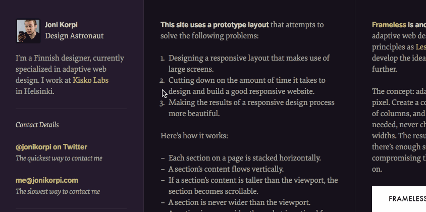
This site previously used an experimental layout that attempted to solve the following problems:
- Designing a responsive layout that makes use of large screens.
- Cutting down on the amount of time it takes to design and build a good responsive website.
- Making the results of a responsive design process more beautiful.
Here’s how it worked:
- Each section on a page is stacked horizontally.
- A section’s content flows vertically.
- If a section’s content is taller than the viewport, the section becomes scrollable.
- A section is never wider than the viewport.
- A section is never wider than what is optimal for its content.
The result is a bi-directional layout. Unlike in a traditional vertical layout, you can quickly scan through each section by scrolling horizontally, and when you find an interesting one, you can drill down on it by scrolling vertically.
Also, the design of each these sections only requires 2 of the 3 states of a responsive design: just right and too small. The horizontal stacking takes care of too big. This leaves more opportunities for making interesting design decisions and cuts down on development time.
Published on